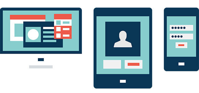

Here’s a scenario: Have you ever pulled up a Web site on your smartphone and all you saw was a tiny version of what you would see on your desktop, requiring you to zoom in and navigate just as you would with your mouse? You are most likely not on a “responsive” Web site. If you were, you’d notice an intelligent adaptation of the layout and content as you maneuver around to better fit the screen of the device you are using.
If the term “Responsive Web Design” is new to you, don’t feel bad. You’re in the majority of the music retailers who read this magazine. Over the next few minutes, you’ll learn what it is, how it works and why you need it.
If you have a relatively simple Web site for your store, modifying your existing site to a responsive design might range from several hundred dollars to a few thousand. If you haven’t redesigned your site in more than four years, chances are you’ll need to go through a complete redesign process. This means that the timing is ideal to go with a responsive template upgrade. If you have a third-party designer working with you on your site, simply ask him or her if it’s possible to overhaul your existing site to be responsive, and what the cost would be.
The largest benefit of a responsive design is its ability to be viewed properly from a mobile device. For the sake of discussion, I’m grouping together tablets and smartphones. If you’re not providing a mobile-friendly experience for your customers, they’ll simply leave and go to your competitor’s site.
There are also businesses now that manage two sites: one formatted for mobile and the other for desktops. A responsive template design can eliminate the need for two different sites, while saving you time, money and resources.
You’ve already heard that the future of the Web is mobile. More evidence comes from a study by Nielsen, which reports that more than 60 percent of all mobile phone owners in the U.S. use a smartphone. Further, Statista says that five billion people will use mobile phones by 2017. It’s obvious that, with these growing numbers, you’ll want to put the best online face on your business, and do everything you can to engage and retain your customers.
What are some of the pros and cons of going with a responsive design?
Pros
- One URL makes it easy for users to interact with the Web site.
- If built properly, your new responsive design automatically adjusts to the device that is accessing the site.
- It simplifies your workflow process and allows you to focus on maintaining one site.
Cons
- You will have to change your entire existing Web site.
- Responsive designs can be tricky, and there is more labor involved in building them, which results in more costs.
- Pages will probably load more slowly. Your full-size images will be downloaded then resized to fit the device accessing the site.
Not sure that you need to upgrade? Perform a brief evaluation of your current site.
Test your Web site on a mobile device: Open your site on your phone or tablet. Manually resize the window and watch how your home page behaves. If you notice a scroll bar appear at the bottom of the window, then it isn’t a responsive site. Rather than just shrinking in overall size, does the site restructure itself to keep the components of the page visible? When you click on your phone number, does the dialer appear? If neither of those things happens, then it’s not a responsive site.
Check for Flash files: If you have slideshows or animations on your site, right click on the object and check the properties to see whether “About Adobe Flash” appears. So far, the iPhone and the iPad do not support Flash. If your site uses it, that content might not be visible to most people who use an iOS device.
How easily can you make changes?: How do you add or modify content? Are you using a CMS (Content Management System) environment? If your site does not easily allow you to make edits, add functionality or create new pages, then you’re missing critical site functionality and appeal.
What about social media integration?: Does your site have a blog or news page? When you post a new article to your blog, events or news pages, can guests easily share those articles or posts to their social media pages? If you do not have a blog or news page—or if guests cannot easily share your content—then you’re missing essential marketing functionality.
Test for search engine optimization: When you look at the title in the address bar, does it change on each page or does it stay the same? If you hover your mouse over images, does the site show any type of explanation of the image? If your site does neither of those, it’s not properly optimized for search engines.
What if your Web site is out of date?: Based on the criteria listed above, if your site fails just one of the tests, you’ll want to get it updated. Why? Because you’re swimming against a tidal wave of shiny, new competitor sites that are benefiting from new advances in code. If your site is not playing on a level field with the competition, you’re going to continue to lose market share.
There is some good news here. Getting an upgrade to a responsive design doesn’t have to cost you an arm and a leg. Responsive Web design code is built using HTML5 and CSS3, which also speeds up load times and is a factor in search engine ranking.
Mobile traffic represents more than 25 percent of all Internet traffic, and we’re well past the tipping point. When people use a mobile search to help make a buying decision, they are…
- 30 percent more likely to visit a retailer Web site
- 57 percent more likely to visit a store
- 51 percent more likely to make a purchase
- 39 percent more likely to call a business
What’s next? Talk to your existing Web development team, or find a firm that you trust. Then…
- ask about a responsive design
- find out the costs involved
- ask how they see the future potential for responsive design
- have them demonstrate how the increase in traffic will affect overall effectiveness
- ask whether they offer a CMS environment that is a proprietary system or WordPress (open source)
If your Web site is more than a few years old, there’s a good chance it’s out of date. Test your site as detailed above to see if it needs an upgrade. Most good sites today are built to be responsive, adjusting automatically to the device a visitor is using. Responsive design is important, and it’ll save you money because it avoids the expense of creating a separate mobile site. Today, mobile traffic drives business. Using a system that simplifies editing, supports social media integration and enhances your search engine optimization is a big winner.
David Hall is Retail Sales Manager and Webmaster for Hartland Music, Inc., and the Waukesha County Conservatory of Music, a full-line, 15,000-square-foot, freestanding facility with more than 2,500 students per week. Contact him at david@hartlandmusic.com.